Friday, March 15, 2024

UCLA Season and Tournament History 97/98 - 23/24

1997-98
Overall Record: 24-9
Pac-10 Record: 12-6
Starters:
C J.R. Henderson (Sr)*
PF Kris Johnson (Sr)
SF Toby Bailey (Sr)*
SG Earl Watson (Fr)
PG Baron Davis (Fr)
* 1st team All-Pac-10
Memorable moments: First game (v Oreg St?).  Baron - Pac-12 Freshman of the year.
NCAA Tourney: UCLA #6 seed
- #11 Miami, #3 Michigan, #2 Kentucky (L)
NBA Draft: #33 Jelani McCoy, #45 Toby Bailey, #56 J.R. Henderson

1998-99
Overall Record: 22-9
Pac-10 Record: 12-6
Starters:
C Dan Gadzuric (Fr)
PF Jerome Moiso (Fr)
SF Jaron Rush (Fr)
SG Earl Watson (So)
PG Baron Davis (So)^/*
^ 3rd Team All-American
* 1st team All-Pac-10
Memorable moments: Baron's UW game (dunk)
NCAA Tourney: UCLA #5
- #12 Detroit-Mercy (L)
NBA Draft: #3 Baron Davis

1999-2000
Overall Record: 21-12
Pac-10 Record: 10-8
Starters:
C Dan Gadzuric (So)
PF Jerome Moiso (So)
F Sean Farnham (Sr)
SG Jason Kapono (Fr)*
PG Earl Watson (Jr)
* 1st team All-Pac-10
Memorable moments: 1) @UNC, 2) Jaron's shot v Stanford.  Kapono - Pac-12 Freshman of the year.
NCAA Tourney: UCLA #6
- #11 Ball State, #3 Maryland, #2 Iowa St (L)
NBA Draft: #11 Jerome Moiso

2000-01
Overall Record: 23-9
Pac-10 Record: 14-4
Starters:
C Dan Gadzuric (Jr)
PF Matt Barnes (Jr)
SF Jason Kapono (So)*
SG Billy Knight (Jr)
PG Earl Watson (Sr)*
* 1st team All-Pac-10
Memorable moments: Arizona (rush court).  Lavin - Pac-12 Coach of the year
NCAA Tourney: UCLA #4
- #13 Hofstra, #12 Utah St., #1 Duke (L)
NBA Draft: #39 Earl Watson

2001-02
Overall Record: 21-12
Pac-10 Record: 11-7
Starters:
C Dan Gadzuric (Sr)
PF Matt Barnes (Sr)
SF Jason Kapono (Jr)*
SG Billy Knight (Sr)
PG Cedric Bozeman (Fr)
* 1st team All-Pac-10
Memorable moments: none
NCAA Tourney: UCLA #8
- #9 Mississippi, #1 Cincinatti, #12 Missouri (L)
NBA Draft: #33 Dan Gadzuric, #45 Matt Barnes

2002-03
Overall Record: 10-19
Pac-10 Record: 6-12
Starters:
C Ryan Hollins (Fr)
PF Andre Patterson (So)
SF Jason Kapono (Sr)*
SG Dijon Thompson (So)
PG Cedric Bozeman (So) / Ray Young (Sr)
* 1st team All-Pac-10
Memorable moments: Beat #1 Arizona (Pac-10 Tourney), Lavin's last season
NCAA Tourney: none
NBA Draft: #31 Jason Kapono

2003-04
Overall Record: 11-17
Pac-10 Record: 7-11
Starters:
C Ryan Hollins (So)
PF T.J. Cummings (Sr)
SF Trevor Ariza (Fr)
SG Dijon Thompson (Jr)
PG Cedric Bozeman (Jr)
Memorable moments: Howland's 1st season, Wooden Court dedication (vs Mich St)
NCAA Tourney: none
NBA Draft: #43 Trevor Ariza

2004-05
Overall Record: 18-11
Pac-10 Record: 11-7
Starters:
C Michael Fey (Jr)
F Dijon Thompson (Sr)*
SF Josh Shipp (Fr)
SG Arron Afflalo (Fr)
PG Jordan Farmar (Fr)
* 1st team All-Pac-10
Memorable moments: Making tourney.   Farmar - Pac-12 Freshman of the year.
NCAA Tourney: UCLA #11
- #6 Texas Tech (L)
NBA Draft: #43 Dijon Thompson

2005-06
Overall Record: 32-7
Pac-10 Record: 14-4
Starters:
C Ryan Hollins (Sr)
PF Luc Richard Mbah a Moute (Fr)
SF Cedric Bozeman (Sr)
SG Arron Afflalo (So)*
PG Jordan Farmar (So)*
* 1st team All-Pac-10
Memorable moments: Pac-10 champ, Pac-10 Tourney champ, Gonzaga comeback, Final Two (Indy).   Howland - Pac-12 Coach of the year.  Moute - Pac-12 Freshman of the year.
NCAA Tourney: UCLA #2
- #15 Belmont, #10 Alabama, #3 Gonzaga, #1 Memphis, #4 LSU, #3 Florida (L)
NBA Draft: #26 Jordan Farmar, #50 Ryan Hollins

2006-07
Overall Record: 30-6
Pac-10 Record: 15-3
Starters:
C Lorenzo Mata (Jr)
PF Luc Richard Mbah a Moute (So)
SF Josh Shipp (So)
SG Arron Afflalo (Jr)^^^/***/*
PG Darren Collison (So)*
^^^ 1st Team All-American
***Pac-10 Player of the Year
* 1st team All-Pac-10
Memorable moments: Ranked #1 for 6 weeks in AP, Pac-10 champ, Afflalo AP 1st Team All-American, Final Four (Atlanta). 
NCAA Tourney: UCLA #2
- #15 Weber St, #7 Indiana, #3 Pittsburgh, #1 Kansas, #1 Florida (L)
NBA Draft: #27 Arron Afflalo

2007-08
Overall Record: 35-4
Pac-10 Record: 16-2
Starters:
C Kevin Love (Fr)^^^/***/*
PF Luc Richard Mbah a Moute (Jr)
SF Josh Shipp (Jr)
SG Russell Westbrook (So)**
PG Darren Collison (Jr)^
^^^ 1st Team All-American
^ 3rd Team All-American
***Pac-10 Player of the Year
**Pac-10 Defensive Player of the Year
*1st team All-Pac-10  
Memorable moments: Stanford comeback to clinch title, Shipp's backboard Cal shot, Pac-10 champ, Pac-10 Tourney champ, #1 seed in West, Final Four (San Antonio).   Love- Pac-12 Freshman of the year.
NCAA Tourney: UCLA #1
- #16 Miss Valley St, #9 Texas A&M, #12 Western Kentucky, #3 Xavier, #1 Memphis (L)
NBA Draft: #4 Russell Westbrook, #5 Kevin Love, #37 Luc Richard Mbah a Moute

2008-09
Overall Record: 26-9
Pac-10 Record: 13-5
Starters:
C Alfred Aboya (Sr)
PF Nikola Dragovic (Jr)
SF Josh Shipp (Sr)
SG Jrue Holiday (Fr)
PG Darren Collison (Sr)*
* 1st team All-Pac-10
Memorable moments: Eldest son's first game (UA)
NCAA Tourney: UCLA #6
- #11 VCU, #3 Villanova (L)
NBA Draft: #17 Jrue Holiday, #21 Darren Collison

2009-10
Overall Record: 14-18
Pac-10 Record: 8-10
Starters:
C Reeves Nelson (Fr)
PF Nikola Dragovic (Sr)
SF Tyler Honeycutt (Fr)
SG Michael Roll (Sr)*
PG Malcolm Lee (So)
* 1st team All-Pac-10
Memorable moments: none
NCAA Tourney: none
NBA Draft: none

2010-11
Overall Record: 23-11
Pac-10 Record: 13-5
Starters:
C Joshua Smith (Fr)
PF Reeves Nelson (So)*
SF Tyler Honeycutt (So)*
SG Malcolm Lee (Jr)*
PG Lazeric Jones (Jr)
* 1st team All-Pac-10
Memorable moments: 2nd son's 1st game, Last game at Classic Pauley over #10 Arizona, Trapani basket
NCAA Tourney: UCLA #7
- #10 Michigan State, #2 Florida (L)
NBA Draft: #35 Tyler Honeycutt, #43 Malcolm Lee

2011-12
Overall Record: 19-14
Pac-12 Record: 11-7
Starters:
C Travis Wear (So)
PF David Wear (So)
G Tyler Lamb (So)
G Jerime Anderson (Sr)
PG Lazeric Jones (Sr)
Memorable moments: none (home games at Sports Arena)
NCAA Tourney: none
NBA Draft: none

2012-13
Overall Record: 25-10
Pac-12 Record: 13-5
Starters:
C Travis Wear (Jr)
PF Kyle Anderson (Fr)
SF Shabazz Muhammad (Fr)*
SG Jordan Adams (Fr)
PG Larry Drew II (Sr)*
*1st team All-Pac-12
Memorable moments: New Pauley, Pac-12 champ, (Bazz Lightyear), Adams' broken foot, Howland's last season.  Shabazz - Pac-12 Freshman of the year.
NCAA Tourney: UCLA #6
- #11 Minnesota (L)
NBA Draft: #14 Shabazz Muhammad

2013-14
Overall Record: 28-9
Pac-12 Record: 12-6
Starters:
C Travis Wear (Sr)
PF David Wear (Sr)
G Jordan Adams (So)*
G Norman Powell (Jr)
PG Kyle Anderson (So)*/^
* 1st team All-Pac-12
^ 3rd team All-American
Memorable moments: daughter's first game, Alford's first season, Pac-12 Tourney Champs (over Arizona)
NCAA Tourney: UCLA #4
- #13 Tulsa, #12 SF Austin, #1 Florida (L)
NBA Draft: #13 Zach LaVine, #22 Jordan Adams, #30 Kyle Anderson

2014-15
Overall Record: 22-14
Pac-12 Record: 11-7
Starters:
C Tony Parker (Jr)
PF Kevon Looney (Fr)
G Norman Powell (Sr)*
G Isaac Hamilton (So)
PG Bryce Alford (So)
* 1st team All-Pac-12
Memorable moments: 16-1 record at home, Bryce Alford's nine 3s (goaltend)
NCAA Tourney: UCLA #11
- #6 SMU, #14 UAB, #2 Gonzaga (L)
NBA Draft: #30 Kevon Looney, #46 Norman Powell

2015-16
Overall Record: 15-17
Pac-12 Record: 6-12
Starters:
C Thomas Welsh (So)
PF Tony Parker (Sr)
G Isaac Hamilton (Jr)
G Bryce Alford (Jr)
PG Aaron Holiday (Fr)
Memorable moments: Upset #1 Kentucky at Pauley, Alford 3-pointer upset UA Westbrook night
NCAA Tourney: none
NBA Draft: none

2016-17
Overall Record: 31-5 
Pac-12 Record: 15-3
Starters:
C Thomas Welsh (Jr)
PF T.J. Leaf (Fr)*
G Isaac Hamilton (Sr)
G Bryce Alford (Sr)*
PG Lonzo Ball (Fr)^^^/*
^^^ 1st team All-American
* 1st team All-Pac-12
Memorable moments: Upset #1 Kentucky at UK, Comeback vs Oregon, 32 point blowout vs u$c, W at Arizona.  Lonzo - Pax-12 Freshman of the year.
NCAA Tourney: UCLA #3
- #11 Kent State, #6 Cincinnati, #2 Kentucky (L)
NBA Draft: #2 Lonzo Ball, #18 T.J. Leaf, #47 Ike Anigbogu

2017-18
Overall Record: 21-12
Pac-12 Record: 11-7
Starters:
C Thomas Welsh (Sr)
PF G.G. Golomon (Sr)
SF Kris Wilkes (Fr)
SG Prince Ali (So)
PG Aaron Holiday (Jr)*
* 1st team All-Pac-12
Memorable moments: The 3 Criminals of China, Upset Kentucky, W at Arizona, swept $c, Holiday led Pac in scoring.
NCAA Tourney: UCLA #11 (Play-in)
- #11 St Bonaventure (L)
NBA Draft: #23 Aaron Holiday, #58 Thomas Welsh

2018-19
Overall Record: 17-16
Pac-12 Record: 9-9
Starters:
C Moses Brown (Fr)
PF Jalen Hill (Fr)
SF Kris Wilkes (So)
SG Prince Ali (Jr)
PG Jalen Hands (So)
Memorable moments: Notre Dame buzzer- beater (Wilkes), Alford fired, @Oregon comeback (9 pts in last minute).
NCAA Tourney: none
NBA Draft: #56 Jaylen Hands

2019-20
Overall Record: 19-12
Pac-12 Record: 12-6
Starters:
C Jalen Hill (So)
F Jaime Jaquez Jr. (Fr)
F Chris Smith (Jr)*
SG David Singleton (So)
PG Tyger Campbell (Fr)
* 1st team All-Pac-12
Memorable moments: Mic Cronin's 1st season (Pac-12 Coach of the Year).  Jaime Jaquez ASU buzzer-beater.  Swept Arizona.  Finished Pac-12 on a 7-1 run, 2nd place.  Pac-12 Tourney cancelled
NCAA Tourney: Cancelled due to COVID-19
NBA Draft: none

2020-21
Overall Record: 22-10
Pac-12 Record: 13-6
Starters:
F Cody Riley (Jr)
F Jaime Jaquez Jr. (So)
G Johnny Juzang (So)
G Jules Bernard (Jr)
PG Tyger Campbell (So)*
* 1st team All-Pac-12
Memorable moments: Chris Smith (ACL), Jalen Hill personal leave, swept Arizona, Juzang 137 points in 6 NCAA games.  FINAL FOUR! Juzang, All NCAA Tourney Team
NCAA Tourney: UCLA #11 (Play-in)
- #11 Michigan State, #6 BYU, #11 Abilene Christian, #2 Alabama, #1 Michigan, #1 Gonzaga (L)
NBA Draft: none

2021-22
Overall Record: 27-8
Pac-12 Record: 15-5
Starters:
F Cody Riley (Sr)
F Jaime Jaquez Jr. (Jr)*
G Johnny Juzang (Jr)*
G Jules Bernard (Sr)
PG Tyger Campbell (Jr)*
* 1st team All-Pac-12
Memorable moments: W over #4 Villanova.  W over #3 Zona.  Undefeated at home (except vs Oregon without fans).
NCAA Tourney: UCLA #4
- #13 Akron, #5 Saint Mary's, #8 UNC (L)
NBA Draft: #30 Peyton Watson

2022-23
Overall Record: 31-6
Pac-12 Record: 18-2
Starters:
C Adem Bona (Fr)
F Jaime Jaquez Jr. (Sr)***/*
G/F Jaylen Clark (Jr)**
G Amari Bailey (Fr)
PG Tyger Campbell (Sr)*
***Pac-12 Player of the Year
**Pac-12 Defensive Player of the Year
* 1st team All-Pac-12
Memorable moments: Pac-12 Champion (first since 2013).  #2 in country after reg season.  W over #8 Arizona on Senior Night.  Undefeated at home 17-0 (25 in a row at home).  Jaylen Clark achilles/Bona shoulder.  Cronin - Pac-12 Coach of the year.  Bona - Pac-12 Freshman of the year.  Jaquez - 2nd Team All-American.  Jaquez - Lute Olson Player of the Year.  Jaylen Clark - Naismith National Defensive Player of the Year.
NCAA Tourney: UCLA #2
- #15 UNC Asheville, #7 Northwestern, #3 Gonzaga (L)
NBA Draft: #18 Jaime Jaquez Jr, #41 Amari Bailey, #53 Jaylen Clark

2023-24
Overall Record: 16-17
Pac-12 Record: 10-10
Starters:
C Adem Bona (So)**/*
F Brandon Williams (Fr)
G Lazar Stefanovic (Jr)
G Sebastian Mack (Fr)
PG Dylan Andrews (So)
**Pac-12 Defensive Player of the Year
* 1st team All-Pac-12
Memorable moments: Only 1 returning starter (Bona).  8 new players (frosh, Internationals, and 1 transfer).  Aday Mara 7'3 frosh from Spain.  Lost to CSUN at home during a 1-8 stretch, followed by 8-1 stretch.  Final Pac-12 basketball season.
NCAA Tourney: none
NBA Draft: TBD

Thursday, July 13, 2023

WC 2026 Roster Prediction #1

GK
Starter: Matt Turner
Gaga Slonina
Zach Steffen

In consideration: Ethan Horvath


Fullbacks
RB Starter: Sergino Dest
LB Starter: Antonee Robinson
Joe Scally
Kevin Paredes

In consideration: Sam Vines, DeJuan Jones, Reggie Cannon, Jonathan Gomez


Centerbacks
Starter: Chris Richards
Starter: Jalen Neal
Cameron Carter-Vickers
Mark McKenzie
Erik Palmer-Brown

In consideration: Miles Robinson, Matt Miazga, Walker Zimmerman


Midfielders
Starter: Gio Reyna
Starter: Tyler Adams
Starter: Weston McKennie
Yunus Musah
Luca De La Torre
Johnny Cardoso
Malik Tillman

In consideration: Jack McGlynn, James Sands, Cole Bassett, Djordje Mihailovic


Wingers
Starter: Christian Pulisic
Starter: Timmy Weah
Brendan Aaronson
Paxton Aaronson

In consideration: Jordan Morris, Cade Cowell, Alejandro Zendejas


Striker
Starter: Folarin Balogun
Ricardo Pepi
Josh Sargent


In consideration: Haji Wright, Brandon Vazquez, Jordan Pefok, Jesus Ferreira


----------------Balogun-----------
Pulisic----------------------Weah
----------------Reyna-------------
--------Adams----McKennie---
Robinson-CCV-Richards-Dest
---------------Turner--------------

The 2022 roster was so young that most of the starters should return.  The only major addition is Balogun, whom we hope will fill the massive WC goal-scoring void from our strikers.

Sunday, June 25, 2023

US Soccer Jersey History 1916-2023

(Updated June 25, 2023.  Initial post from 2010)

This is the (chronologically compiled) history of US Soccer jerseys (as best as I can figure out given the limited resources online).  Some are historical pictures, some are recently created throwbacks, some may even be just flat out wrong (my apologies in advance).  The editions worn in a World Cup are noted.

1916 White
This seems to be a picture of an early US "All-America" team on a tour of Norway and Sweden in 1916.  It could be the trip in which US Soccer played its first international match, in Stockholm vs Sweden.  (We won 3-2.)  The US shield crest appears very large and centered on the chest.  The v-neck collar is clearly a darker color, as are the socks.  If this is the first official US jersey, I'll give it a 6 out of 10 for being first.


1930 White (World Cup)
This is a picture of the US team who participated in the first ever World Cup in 1930.  Just like the 1916 version, its a simple, white long-sleeve v-neck with a US flag themed shield centered on the chest.  The shield, having been reduced in size since 1916, is the founding father to our current crest, which showed up in 1995.  No matter what changes will occur to the crest in the future, I hope we never lose the shield look.  This shield has no letters on it, letting the stars and stripes do all the talking.  Unfortunately, without the shield, this jersey could pass for underwear.  4 out of 10.


1934 Blue (World Cup)
Who knows if this is actually the shade of blue we wore back in '34?  But I would have preferred a darker, navy blue.  The crest is also a little too wide and round for my tastes, as if it couldn't decide if it wanted to be a circle or not. 3 out of 10.


1950 Home (World Cup)
This design is the next evolutionary step to the '30s look and has become instant legend after the 1-0 upset of England..  They added USA letters to the improved shape of the crest and added the famous diagonal red stripe, of which they are continuing to base throwback variations to this day.  Retro throwback special release jerseys with sashes had been released 3 times, I believe, mostly to a rousing response, but none were the actual jersey that is worn for a 2 year cycle until the 2010/11 World Cup release.  9 out of 10.


1959 Home - Pan America Games
A Pan America USA crest was used for the 1959 Pan America Games, where the US won the bronze medal, only behind Argentina and Brazil.  Another addition was the strange lace-up collar, which is essentially a feminine look nowadays.  Lastly, the diagonal stripe turned into a 2 stripe design, which I actually prefer over the wide sash of the 2010 editions.  But it can't make up for the crest and lace.  3 out of 10. 


1972 Home (Olympics)
  (US Olympic Team)
Worn at the '72 Olympics, this appears to be a modified v-neck jersey, paired with red shorts.  The crest itself is hard to make out, but it may be a shield with perhaps "USA" lettering.  2 out of 10.


1974 Red
(Kyle Rote Jr.)
Worn in a 1974 game vs Mexico, it drops a crest and goes with awful USA lettering.  And without that awful lettering, this could pass as USSR.  A forgettable effort during the dark ages of US Soccer.  1 out of 10.


1979-81 Home
The white version of the standard Adidas template.  They lacked the foresight to go back to a shield, unfortunately.  2 out of 10.


1981 Blue (Youth)
 
(Todd Saldana)
I have no idea if only our youth team wore this style, but since it was worn in international competition (shown here vs Poland), you'd think Adidas would have outfitted our men's team in it as well.  Either way, its worth a look.  This kit is quite the departure from our ugly 70's template.  This design is the first modern design I've come across in US history.  It could actually still be used today.  6 out of 10.


1983 Team America (NASL)
(Dan Canter)
Apparently US Soccer joined the NASL that one season as a club team so they could have more training time together.  Not sure that they played any international games in this kit, but we'll include it here anyway.  Does this shirt remind anybody of anything?  Say, a certain 2012 release?  Not a fan.  1 out of 10.


1984 Home
A very 80's look by Adidas.  Not horrible, not really memorable.  The USA "flag" font however looks ridiculous.  They would have been better off with solid letters or with our old crest/shield.  4 out of 10.


1984 Blue (Olympics)
At least we know that the blue version was worn in Olympic competition.  Not sure about the exact shade of blue, but either way, its an improvement over white or red.  5 out of 10.


1984 Red
This is starting to look more and more like a goalkeeper kit to me.  Not sure why there is an added patch below the lettering but a 4 year old could have designed it. 3 out of 10.


1988 Home
For our first successful WC qualifying campaign in 40 years, Adidas put out another classic clean look.  The only feature that sticks out is the blue stripe on top of the shoulder, slightly (American) football-ish.  Also, a new circular crest has appeared for the first time, definitely an upgrade.  A traditional US shield is actually enclosed inside the ring.  The crest looks better up close but it appears too busy from a distance.  5 out of 10.


1988 Away 
This actually has a very distinct V-shaped thread pattern (which almost makes it look like a soft blanket).  As opposed to the home, it loses the collar and opts for a V-neck.  Also, the crest is darkened for this away version and looks even busier, if that is possible.  Actually, it reminds me of a US military crest.  Overall, one of our more interesting looks.  6 out of 10.


1989 Home
(Paul Caligiuri)
One site lists this as the 1986 home.  Others says that it was the '90-91 edition.  Perhaps they wore it in the mid 80s and brought it back for '89 qualifiers.  Maybe they had different WC jerseys just for the '90 WC but also used this through '91.  Who knows?  What we know is that this is the design in which Caligiuri scored the "shot heard round the world" back in Nov 1989.  I'd give this simple look a 5 out of 10.


1988-? Away
(Mike Windischmann)
This away jersey seems to have been worn in games in '88 as well as possibly 1990-92.  (There are pictures of Wynalda wearing this shirt and his international career didn't start until the 90s.)  Like the white home version above, it is difficult to pin down when this edition came out.  However, you'll notice that the adidas logo is their famous trefoil, which they seems to have been replaced after the '90 WC for their new triangular logo.  Sure, the darker circular spots livens up the plain classic design a bit, but not for the better.  4 out of 10.


1990 Home (World Cup)
(Tab Ramos)
For our first World Cup in 40 years, this was a pretty poor effort.  To me, this doesn't say, "the USA is back!".  Its more like, "you ain't gonna remember us anyway."  The longer I look at it, the more I think it almost has a Native American look, but I doubt that's what they were going for.  3 out of 10.


1990 Away (World Cup)
While probably released for the '90 WC, the US wore its home whites for all 3 group matches.  Basically a reverse of the home look, Adidas made an emphasis of the over-the-shoulder stripe look from the '88 home which they would then continue in the 1992-94 edition.  I like it slightly better than the white, which isn't saying much.  4 out of 10.

 
1991 Blue
(Dominic Kinnear / Peter Vermes?)
This jersey was worn in the inaugural 1991 Gold Cup, won by the US in an upset.  It ushers in the triangular adidas logo, instead of the traditional trefoil.  Also, Adidas becomes extremely aggressive with the 3 stripes for the next few years until they completely lost their minds for the '94 world cup.  This '91 edition has a white collar and the old crest, which sets it apart from the '92 edition.  5 out of 10.


1992-1994 Home
(Cobi Jones)
The new US crest is not much of a crest at all.  But we continued the swooshing ball look up until 2016.  I definitely prefer the older military-styled crest.  As for the blue and red stripes, it is memorable for ushering in the modern look in US jersey history.  6 out of 10.


1992-1994 Away
(Fernando Clavijo)
A slight variation to the '91 Gold Cup since these don't have the white collar.  Red shoulder stripes may have helped, but the white just looks obnoxious.  And the blue is still too light.  You would never guess that this was a US jersey.  4 out of 10.


1993 Third
(Brian Quinn)
It seems that Adidas tried balance out the jersey with 3 shoulder stripes on the both sides with this release.  More of a bad thing does not a good jersey make.  At first glance, I actually thought this was a France jersey.  6 out of 10.


1994-1995 Home (World Cup)
(Marcelo Balboa)
Yes, I get how the wavy red lines looks like our flag just like what they were trying to do with the white stars on a blue background in the home version.  But I just don't like vertical stripes on a jersey, especially wavy ones.  And for some reason, the sleeves were left white.  2 out of 10.


1994-1995 Away (World Cup)
(Alexi Lalas) 
One of the most memorable jerseys in US history.  Also one of the worst.  Who decided that a denim look would work on a soccer jersey?  And why unleash this thing during the first World Cup we ever hosted?  Alexi Lalas is probably the only one who can pull it off.  These two efforts probably led to the switchover to Nike.  1 out of 10.


1995-1998 Home
(Thomas Dooley)
Nike takes over US Soccer and starts with a solid effort.  I like the polo shirt look to it and the solid stripe across is a respectable look for any soccer jersey.  This US crest, wisely adding the shield again, appears here for the first time.  7 out of 10.


1995-1998 Away
(John Harkes)
Nike decided to go away from the lighter blue to the navy blue, you know, like the color we have on our flag.  6 out of 10.


1995-1998 Third
(Eric Wynalda)
Nike's first US soccer jersey looked much better in white and navy blue.  This light blue one just looks dull and very.... blah.  4 out of 10.


1998-2000 Home (World Cup)
(Brian McBride)
Nike keeps the stripe-across-the-chest-polo-shirt-look going.  It does looks a little like a tennis shirt but I like the classic feel overall.  One of my favorite designs.  9 out of 10. 


1998-2000 Away (World Cup)

(Claudio Reyna)
This is one of my favorite US jersey of all time.  I like the vibrancy of the red as well as the usage of white and blue.  It has to be paired with the blue shorts, however.  10 out of 10.


2000-2002 Home
(Earnie Stewart)
This design is simple and clean but in the end, it looks like a lazy effort.  Its basically a white t-shirt with blue trim.  Great, thanks.  Okay, so this t-shirt is still better than the 94 WC jerseys.  4 out of 10.


2000-2002 Away
(Landon Donovan)
Since it has color, it rates better than the home whites.  While red is a great jersey color and I loved the '98 edition, I still think our main away color should be navy blue.  Red has been the predominant color of just about all US enemies - the redcoats, the nazis, the communists, the devil, etc.  And if we do wear red, it has to be paired with blue shorts.  5 out of 10.


2002-2004 Home (World Cup)

(Brian McBride)
When these first came out, I was completely in love with the shirt.  Now I think I was just in love with the success of the team.  Some critics have said it just looks like a volleyball jersey, but I still do like the angular designs under the arms.  I also like the font used for the numbers.  7 out of 10.


2002-2004 Away (World Cup)
(John O'Brien)
The away edition loses the collar but preserves a cool athletic look to it.  Too bad we lost both games in the WC in which we wore it.  8 out of 10.


2003 Third
(Cory Gibbs)
The first 1950 throwback was released with a blue sash instead of the original red.  9 out of 10. 


2004-2006 Home
(Claudio Reyna)
Again, Nike goes to a simpler look during the non World Cup cycle.  This time, the front has a one piece framed design, which I grew to like a lot.  What I did not like so much was the dark patch on the back where the name is supposed to be.  I also did not like the circle around the number font, however.  I know its on the Nike soccer balls, but did it have to be on the jersey too?  6 out of 10.


2004-2006 Away
(Taylor Twellman)
Again, it is merely the reverse of the home jersey but somehow even more boring.  4 out of 10.


2004 Third
(McBride / Jonathan Spector)
This throwback to the 1950 shirt was not worn nearly enough.  They used the red stripe instead of '03s blue.  I prefer this crest to our current one as well.  The 3/4 sleeves keep this one from perfection.  8 out of 10. 


2006 Special (Don't Tread on Me)
(Eddie Lewis)
This "Don't Tread on Me" special release was worn just once in a warm-up game to the World Cup.  The look of it is beautiful, again with the rich red and a two toned sash.  I also prefer the collar.  The only downside to this jersey for buyers is that the version released to the public was made of a cheap polyster material, or something like that.  10 out of 10.


2006-2008 Home (World Cup)

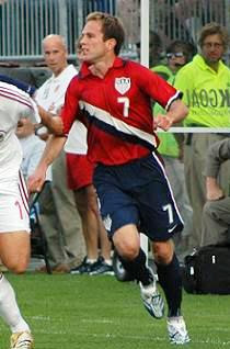
(Clint Dempsey)
Nike's Dri-fit age begins here as well as their more fitted look for jerseys.  I do not mind the collar-less look of these because the two toned stripe down the left side is unique and instant classic.  The stripe extends down the shorts to the left sock.  Awesome.  The crest is nicely enlarged here and outlined with a gold trim.  Lastly, I also like the college font used for the numbers.  10 out of 10.


2006-2008 Away (World Cup)
(Damarcus Beasley)
Nike brought back the 96-98 away look for the 2006 world cup this time without a collar.  I liked how the home and away versions were completely different but I marked this one down for unoriginality.  5 out of 10. 


2007 Third
 
(Michael Bradley)
This jersey was memorable because of the hat trick that Donovan dropped on Ecuador.  The design seemed to come out of left field with no throwback theme or really any correlation to any other US shirt.  By itself, I don't think its so bad, but the shade of blue is not to my liking and the thin pinstripes seem out of place on the field.  4 out of 10.


2008-2010 Home
(Frankie Hejduk)
This off cycle jersey again goes for the plain look but this time has big light blue hoops.  While I'm not a big fans of the hoops, we did pull off the Spanish conquest in these.  6 out of 10.


2008-2010 Away
(Carlos Bocanegra)
For the first time, the US uses a color other than blue or red for the away jersey.  I'm not sure what color this is, anthracite?  I actually went months thinking that it was a dark blue but its actually probably closer to black?  Who knows?  Let's stick to the navy blue please. Other than that, this was just plain.  4 out of 10 .


2010-12 Home (World Cup)
(Landon Donovan)
This is obviously another nod to the classic 1950s kit.  While I prefer the white tops to be paired with blue shorts, FIFA's rules don't always allow it, which is why Landon scored the Algeria goal in the all-whites.  The light gray sash seems to me to be an indecisive touch by Nike - on television, it is hardly noticeable at all.  Go big or go home.  It should have been the navy blue or perhaps two toned - red and blue.  Also, the sash should have been thinner and slightly more horizontal so that it doesn't run shoulder to hip - and therefore less pageant-like.  7 out of 10.


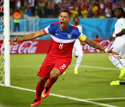
2010-12 Away (World Cup)
(Michael Bradley)
US wore the away blues for the first 2 matches of the WC.  As much as I did not really prefer the white sash, the entire look did grow on me, especially when Dempsey, Landon and Bradley scored giant goals in 'em.  It is essentially the reverse of the whites, except that the white sash is now very prominent.  Again, a red stripe inside or alongside the white would be an improvement.  I have yet to mention the strange stripe on the socks for all versions - it is horizontal across the shin but goes down behind the calf.  Just weird.  6 out of 10. 


2011 Third
(Brek Shea)
After a tremendous amount of fan interest, Nike released this extremely popular red kit, since US diehard fans (supporter sections) prefer to wear red at games.  In general I personally prefer the blue as the standard away color, but because Nike decided to use a blue sash instead of the beauty pageant-ish white sash, this one rates higher.  8 out of 10.


2012-14 Home
(Steve Cherundolo)
This may only be the 2nd time in US jersey history that our home jersey is not predominantly white (94 flag jersey being the other).  In addition to the red stripes, it still has a sash, though it's extremely muted and nearly invisible - "subtle tonal" sash, I think they call it.  The 'Where's Waldo?' jersey, might be what we end up calling this edition.  After finally seeing it on the field of play, it is my least favorite US jersey since Adidas' 94 World Cup shirts.  I get that the red stripe look is straight off our flag.  But it actually looks like a yuppie sailor outfit, the kind you'd wear if you were dressing up at Halloween.  And they didn't even have the conviction to run the stripes all the way around.  The back has a horrendously huge, white square box, presumably so that the number and name can be displayed inside.  The past 3 Nike off-World Cup ('00, '04, '08) home jerseys have been fairly plain.  They would have been better off sticking to that plan.  1 out of 10.


2012-14 Away
(Jozy Altidore)
Nike is going with the "sash" design for this off-WC 2 year cycle.  It's rumored that Nike may decide to keep the sash indefinitely as US' trademark look - I'm not entirely against the idea although I'll miss seeing the new ideas they come out with every 2 years.  For the blue away, they have changed the white pageant sash to a dark one - a marked improvement.  However, the sleeves are now white, giving the whole jersey the look of a vest - a marked regression.  The new tri-color collar reminds me of a ribbon, but I don't hate it.  Though we beat Italy in Italy in this jersey's debut, I'm giving it just a 6 out of 10.


 2013 Centennial Special
(Michael Bradley)
This new jersey commemorates the 100th anniversary of US Soccer's existence (1913).  Just as the pre-1950s jerseys were, it is plain white, with the shield being the main attraction.  However, I wish they had the guts to use an enlarged shield and place it centered on the chest, just as it was 100 years ago.  The blue v-neck collar and thick arm cuffs are a nod to the first US jersey as well.  Yes, overall this throwback is clean, simple and elegant.  And yes, it is a necessary (and hopefully extended) relief from the horrific "where's Waldo" disaster.  But ultimately, the reality is that this jersey is nearly identical to the '00-'02 Home jersey, except with the throwback shield.  Furthermore, I personally prefer the shield to say 'USA' on it.  7 out of 10.


2014-16 Home (World Cup)
(Jermaine Jones)
After ditching the traditional home whites for the "where's waldo" horror show, Nike went back to what it began back in 1995 for every edition of our home jersey.  I actually love that our home jersey is white.  But I'm not too excited with this release.  At first glance, this looks like those travel polos that our team wears on the plane.  Or something Federer wears at Wimbledon.  I've got no problem with collars, but why are there buttons on a jersey?  However, the biggest mistake is the lack of imagination in a World Cup year.  Look at our last two WC home releases.  One had a vertical stripe '06, the other a (faint) diagonal stripe '10.  Like it or not, they were at least unique designs to the US.  This one is nearly identical to England's 2010 WC home.  Plain, white polo with buttons.  Ok, ok, up close, it has thin, gray pinstripes, but they're undetectable from a distance.  Bring back a red/blue two toned stripe somewhere.  Anywhere.  They call this a classic, I call it boring.  As for the crest, a lighter shade of blue has been used predominantly throughout.  4 out of 10.


2014-16 Away (World Cup)
(Clint Dempsey)
For the first time since the red kits of 1998 and 2000, the away jersey is not predominantly navy blue.  Technically, its mostly red on the front and completely red on the back.  In a Nike-crafted statement, Dempsey hails it as a "patriotic colorway".  Is this design unique as US jerseys go?  Absolutely.  Is it American?  No.  It looks like Russia invaded Nike HQ.  Not acceptable at all.  Adidas actually had us in a lighter shade of blue all the way up through the '94 WC (denims!?!) but when Nike took over in '95, they went to dark blue.  Besides, the barely-worn pinstripe third jersey of '07, this is the first time they've gone back to that lighter shade.  Nike, please go back to the blue from our flag.  And just as the Where's Waldo stripes did, I think it looks better on our women's team than on our men.  But, I must admit that this kit has grown on me a bit since its release.  Unlike its home counterpart, it is an unique design not often seen in futbol.  6 out of 10.


2015 Third
(Fabian Johnson)
Just as they did in 2011 and 2007, Nike has released an alternate away jersey the year after a World Cup.  And just like last year's away WC jersey, Nike has decided to keep the lighter blue color scheme.  (See complaints about the lighter blue above).  Well, sort of.  They call it a "stylish gradient design" (think sedimentary rock) and it "gradiently" incorporates white up at the neck/shoulder area, a lighter blue for most of the shirt and a dark blue strip from the waistline down.  The brightness of the white neck/shoulder area looks completely out of place and detracts from the look.  On the plus side, the shorts and the socks are dark blue and the thick white stripe running down the side of the entire kit works.  However, just like the "Where's Waldo" and last year's "Bomb Pop" designs, this looks much more fitting for our women's team than our men's.  It leads me to believe that this was designed with this year's Women's World Cup in mind.  At least it isn't predominantly red.  3 out of 10.


2016-18 Home
(Gyasi Zardes)
At first glance though, it is an interesting take to our traditional white kit.  The design reminds me somewhat of the 2004 edition, where the cut of the shoulder/arm seams frames the torso to give it an athletic look.  It can also look like a raglan baseball shirt.  My major gripe though is still with the lightness of the blue.  They brought in the lighter shade for the 2014 WC and I'm hoping it goes away in time for the 2018 WC.  Also, the white front looks like its lacking something - a stripe running in any direction would be an improvement.  4 out of 10.


As for the new crest, I'm glad they kept the shield, used the letters 'USA' and went to blue letters and red stripes (instead of the previous blue stripes and red lettering).  However, the narrow design and the flat top give it an overly modern look and therefore robs it of a certain timelessness.


2016-18 Away
 (DeAndre Yedlin)
Because it is black, the away version looks more like a training/warmup shirt than the white version - you know, like an Under Armour compression shirt worn for workouts or under football pads.  I am not bothered by the different color sleeves, however I do like that the blue is closer to that of our flag.  The black patches on the chest muscles is much more noticeable on the black version, and it gives it the look of a superhero's body armor.  Should've gone all in and put in an 8-pack like Italy did a few years ago!  I kid.  Ultimately, even though I would have preferred if they used the navy blue instead of black as the predominant color, I don't mind experimentation with the away kits during these off-WC years.  Also, you probably need to workout before wearing it.  5 out of 10.


2017 Third
(Christian Pulisic)
The last time the US used a predominantly red kit was the 2011 Third.  The difference was that the 2011 design was developed uniquely for the US' 2010 World Cup.  This 3rd edition of the 2016 kit is simply the red take on the current Nike template.  Even more pathetic is the fact that it is virtually identical to England and Portugal - both have the same red-with-black-shoulders color scheme.  There is little that is unique, much less American about this 3rd kit.  Had they logically decided to use navy blue shoulders, as they did for one of the 2016 Away shoulders, and navy blue shorts, I would have been on board.  The red monochrome crest adds to the overly red and non-American look.  And lest you think I'm just hatin' on red kits, the highest rating given out in the last 8 years was the 2011 Third red kit.  Let's not reward this lazy effort.  2 out of 10.


2017 Gold Cup Special
(Jordan Morris)
Coming off possibly the least American jersey we've ever had (-red and black, really?  Are we commies?), Nike decided to go exactly the opposite direction for the 2017 Gold Cup.  For the first time since the 2012 Away (which was 5 years ago!), we've got a US flag navy blue as the base color.  We've got the white stars from our flag.  We've got red hoops to make all "Waldo" lovers blush.  This jersey screams U-S-A! over and over in the jingoistic fashion the whole world hates us for.  For that reason, I'm giving it an 9.  Remove the slightly over-the-top stars from the shoulders and I would've entertained a 10.  (It already has subtle blue stars on the blue stripes).  I'd even be willing to go with this base design as our kit identity that so many are craving, as long as that navy blue is incorporated somewhere  9 out of 10.


2018-2020 Home
(Christian Pulisic)
Love it.  These home kits have a bold red and blue design which is a bit of a departure from our recent bland editions and also reminds me of our colorful 80s home kits.  I appreciate the way they have incorporated two very popular ideas in the history of US jerseys into one - the "Waldo" hoops of 2012 (horizontal stripes) and the classic diagonal stripe (or sash) of 1950.  They cleverly represented the diagonal stripe on the Home with the blue part of the red-blue stripes, which I liked even though it is a lighter shade than that of our flag.  However, they did not choose to subtly fade the stripe into the white, instead leaving a strange pixeled unfinished look.  That drops this kit a point down to 9 out of 10.


2018-20 Away
(Christian Pulisic)
Counting last summer's Gold Cup edition, Nike has now released two straight navy blue kits for the US, to my delight.  Again, this is an innovative combination of the popular hoops from 2012 and the traditional 1950 diagonal stripe. The diagonal stripe doesn't actually exist on this Away version, but the horizontal stripes end where the diagonal would be and therefore delivers the look first made popular in the US 1950s kit.  It is interesting to note that the stripes on the white home kit is on the crest side, while the stripes on the away kit is on the swoosh side.   They couldn't help but keep their beloved lighter blue as an accent on the away kit, and that keeps this kit as a notch lower than the aforementioned 2017 Gold Cup edition.  But I would have been excited to see them sport this look in Russia this summer.  Sigh.  8 out of 10.


2019 Third
(Michael Bradley)
It seems that every 2 years, Nike is coming out with an alternate away design.  Having satisfied the masses (or at least me) with a beautiful blue last year, they are back to the red, last visited in the completely uninspired 2017 version.  This one at least has stars and stripes faintly, but artistically used, which makes it unique though not appealing. Its worth mentioning that this kit was designed for the women's World Cup summer, and probably with an eye to that fanbase.  From a distance it has a velour look to it and that 80s softness just doesn't appeal to me.  I dislike the red, I dislike the light blue numbering & socks and I dislike the velour vibe.  4 out of 10.


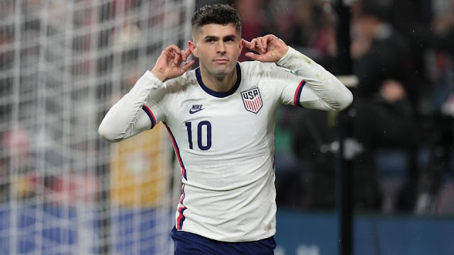
2020-22 Home

(Christian Pulisic)
Since we've had a layoff of 12 months in between games, most of us don't care what they wear to play.  Fresh off the best and most inspired Home jersey design we've had since 2006's WC edition, Nike defaulted back to its trend of bland white kits during non-WC years.  This one has a distinct 80s retro look - see 1979 Home and 1989 Home editions above, although the 2000 design also wants some credit. Perhaps Nike thinks adding in an old school logo will encourage us to add to cart.  If you like it, you'll call it a throwback.  The rest of you will call it lazy.  Seriously, I've spent more time writing this review than they did designing this kit.  Positives: at least its not light blue trim.  3 out of 10.


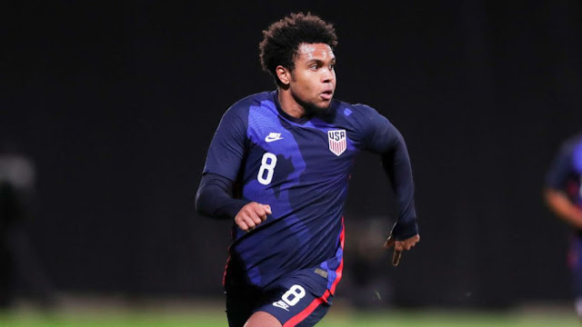
                                2020-22 Away
(Weston McKennie)
Hmm, a river runs through it?  That's the imagery I see.  Is this kit a nod to America's national parks or some of our great rivers?  If that's the case, I'm all in.  One thing I do know is that Nike has given us a truly unique, non-templated design, which is surprising in a non-WC year.  No other country can claim this look and of course I'm always supportive of the dominant navy blue.  But would it be something most fans would wear?  Does it have a chance to be legendary?  On both accounts, I think no.  But let's applaud the effort.  6 out of 10.


                                2021 Third
(Brendan Aaronson)
Nike has again released its 3rd jersey as expected the year before the World Cup 2022 releases.  Is this a work of modern art?  Or a jumbled mess?  I haven't met a single person who didn't react negatively at first sight.  But at least Nike used our colors. This is only the 2nd time we've used our flag blue and red in our away jersey in the last 10 years.  And its completely 100% unique.  And if you are far away enough, you can't see the crazy.  So I'll add 2 points to get this up to a 5 out of 10.


                        2022 Home (World Cup)
(Tim Weah)
After 8 long years, USMNT will finally be appearing in the World Cup in November.  Unfortunately, we will be appearing in this unexciting kit.  This version reminds me of the 2004 shirt, with a framed chest area (also 2016 shirt) as a result of a fancy collar design, and the centered crest.  The centered crest, of course, is a bit of a throwback to our first jerseys back in 1916-30s.  The only other design feature are the two-toned stripes on the shoulders, which also reminds us of American football jersey.  (On the long sleeve version, the stripes makes it look like a hockey sweater.)  What makes this jersey bland is the lack of design elements on the front - no stripes, no sash, or anything else even more creative.  It's just not a great representation of the youthful, colorful, and energetic resurgence of our new team.  Too bad we couldn't have re-used the epic 2018 Home jersey, which deserved to be, but missed out on being seen on the world's biggest stage.  This one is slightly less bland than the 2020 Home.  Slightly.  4 out of 10. 


                        2022 Away (World Cup)
(Tyler Adams)
This jersey reminds me a little of the 2020 Away, but instead of an homage to our nation's rivers, this looks like outer space, perhaps pointing us to aspire as high as the stars.  Just like the 2021 Third, this year's design is again 100% unique.  I dare say that it will probably grow on us, especially if we wear to upset England in the WC.  But right now, I can't shake the thought that this looks like a training warm-up top.  Unlike the Home version, this one doesn't emphasize our colors and isn't uniquely American.  But, again it is unique.  6 out of 10.


                                2023 Third
(Brandon Vazquez)
Nike has used the Women's 2023 WC Away as USMNT's Third for 2023.  And for the 2nd straight year, they have opted to use a lighter blue as the primary color.  It also seems that every 8 years, Nike returns to that lighter blue for the Third jersey (2007 Pinstripes, 2015 Gradient) and every time, it lacks anything distinctive American about it.  (The socks use a darker blue coupled with red, and its the best part of the kit).  The shirt is also the 4th straight Third/Away edition that uses an unique amorphous design.  However, this time the design is less obvious and doesn't show as well at a distance.  What is immediately noticeable no matter the distance are the bright red accents, including the fully red "speckled design" badge.  I'm not a fan of obscuring our awesome badge, however the speckle design is a nod to the Women's WC home white this year which I actually love.  This 2023 Third, not so much.  3 out of 10.