(5/16/12 - Updated chronological pictorial jersey history can be found here: US Soccer Jersey History)
Last year before the World Cup, I posted a history of US jerseys from 1990 on. Since the US released a 3rd version of last year's World Cup kit earlier this year, this time in red, I decided to add on to that pictorial history with some others old school ones I've found. Maybe with next year's release, I'll compile both parts chronologically. I tried to only show players in action with these kits last year, but this time it was impossible. Review:
US Soccer Jersey Pic History, Pt 1.
2010-12 3rd Kit - released 2011 (Juan Agudelo)
This red kit has been fairly popular among diehards, since the US supporter sections prefer to wear red at games. It looks great, but in general I personally prefer the blue as the standard away color. For this particular kit, Nike fortunately decided to use a blue sash instead of the beauty pageantish white sash - good call. 3.5 out of 5.
2010-12 Home (Landon Donovan)
This is obviously another nod to the classic 1950s kit. While I prefer the white tops to be paired with blue shorts, FIFA's rules don't always allow it, which is why Landon scored the Algeria goal in the all-whites. The light gray sash seems to me to be an indecisive touch by Nike - on television, it is hardly noticeable at all. Go big or go home. It should have been the navy blue or perhaps two toned - red and blue. Also, the sash should have been thinner and slightly more horizontal so that it doesn't run shoulder to hip - and therefore less pageant-like. 3 out of 5.
2010-12 Away (Clint Dempsey)
US wore the away blues for the first 2 matches of the WC. As much as I did not really prefer the white sash, the entire look did grow on me, especially when Dempsey, Landon and Bradley scored giant goals in 'em. It is essentially the reverse of the whites, except that the white sash is now very prominent. Again, a red stripe inside or alongside the white would be an improvement. I have yet to mention the strange stripe on the socks for all versions - it is horizontal across the shin but goes down behind the calf. Just weird. 3 out of 5.
Historical: Some are vintage jerseys and some are recent retro throwbacks. Either way, we get a sense of the evolution of the US kit.
1930 White
I believe this is a picture of the US team who participated in the first ever World Cup in 1930. Its a simple, white long-sleeve v-neck with a US flag themed shield centered on the chest. The shield is the founding father, if you will, to our current crest, which showed up in 1995. No matter what changes will occur to the crest in the future, I hope we never lose the shield look. This shield has no letters on it, letting the stars and stripes do all the talking. Unfortunately, without the shield, this jersey could pass for underwear. 2 out of 5.
Who knows if this is actually the shade of blue we wore back in the '30s (or whether we wore this in 1930 or 1934 - perhaps both?) but I would have preferred a darker, navy blue. The crest is also a little too wide and round for my tastes, as if it couldn't decide if it wanted to be a circle or not. 1.5 out of 5.
1950 Home
Obviously a reproduction of the 1950 kit, this design is the next evolutionary step to the '30s look. They added USA letters to the improved shape of the crest and added the famous diagonal red stripe, of which they are continuing to base throwback variations to this day. 4.5 out of 5.
1959 Home - Pan America Games
Interestingly enough, a new crest was used possibly just once for the Pan Am Games. No word on why they thought the USA included North, Central and South Americas. Another addition was the strange lace-up collar, which is essentially a feminine look nowadays. Lastly, the diagonal stripe turned into a 3 stripe design, which was originally the bold colors of our flag, not the faded version you see here. All in all, just not that great. 1.5 out of 5.
1975 Away
It looks like a child's pajama top, this time in a vibrant red (the pic inaccurately shows a faded red) with just awful USA lettering in place of a crest. A forgettable effort during the dark ages of US Soccer. 0.5 out of 5.
1984 Home
A very 80's look by Adidas - I do prefer the blue to the red version. The USA font however looks ridiculous. They would have been better off with solid white letters. 2 out of 5.
1984 Away
This is starting to look more and more like a goalkeeper kit to me. 1.5 out of 5.
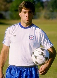
1988 Home
For our first successful WC qualifying campaign in 40 years, Adidas put out a solid classic clean look. The only feature that sticks out is the blue stripe on top of the shoulder, slightly American football-ish. Also, a new circular crest has appeared for the first time. There is actually the traditional US shield inside the ring. The crest looks better up close but it appears too busy from a distance. 3 out of 5.
1988 Away
This actually has a very distinct V-shaped thread pattern (which almost makes it look like a soft blanket). As opposed to the home, it loses the collar and opts for a V-neck. Also, the crest is darkened for this away version and looks even busier, if that is possible. Actually, it reminds me of a US military crest. Overall, a solid effort. 3.5 out of 5.
1990 Away
This is the first design that would see WC action since 1950. Basically a reverse of the home look, Adidas made an emphasis of the over-the-shoulder stripe look from the '88 home which they would then continue until the infamous 1994 set. I like it slightly better than the white, which isn't saying much. 2.1 out of 5.
1995 Third
Nike's first US soccer jersey looked much better in white and navy blue. This light blue one just looks dull and very.... blah. 2 out of 5.
1996 Third
I honestly had not seen this one before but apparently it was used during the Gold Cup in '96. The dark horizontal stripes, perhaps a predecessor to the '08 release, combined with the dark trim gives it a very sharp look. I also like the red number font. 4 out of 5.
2003 Third
Another obvious 1950 throwback was released with a blue sash instead of the original red. 4.5 out of 5.
1988 Home?
This needs more confirmation. One site lists this as the 1986 home. Another says that it was the 91-92 edition. I'm not sure either is right. Is this the kit in which Caligiuri scored the "shot heard round the world" back in 1989? It certainly looks similar. (Harkes below celebrating after the Trinidad game.) Hmm...
1996 Third Blue?
No idea if this is legit or not. But it seems to be the exact inverse of the 1996 Third white version.


No comments:
Post a Comment